Syncfusion.Blazor.SplitButtons
33.2.13
Prefix Reserved
dotnet add package Syncfusion.Blazor.SplitButtons --version 33.2.13
NuGet\Install-Package Syncfusion.Blazor.SplitButtons -Version 33.2.13
<PackageReference Include="Syncfusion.Blazor.SplitButtons" Version="33.2.13" />
<PackageVersion Include="Syncfusion.Blazor.SplitButtons" Version="33.2.13" />
<PackageReference Include="Syncfusion.Blazor.SplitButtons" />
paket add Syncfusion.Blazor.SplitButtons --version 33.2.13
#r "nuget: Syncfusion.Blazor.SplitButtons, 33.2.13"
#:package Syncfusion.Blazor.SplitButtons@33.2.13
#addin nuget:?package=Syncfusion.Blazor.SplitButtons&version=33.2.13
#tool nuget:?package=Syncfusion.Blazor.SplitButtons&version=33.2.13
Syncfusion® Blazor SplitButton Components
A comprehensive suite of Blazor button components for grouped buttons, dropdown menus, split buttons, and progress buttons. Includes Button Group, Dropdown Menu, Split Button, and Progress Button components.
Supported components
This package includes the following components:
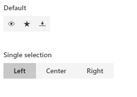
Blazor Button Group component
The Blazor Button Group component is a series of buttons aligned vertically or horizontally.
Key features:
- Horizontal and Vertical Layout: Arrange buttons horizontally or vertically
- Selection Modes: Single or multiple selection modes
- Predefined Styles: Built-in button styles and appearances
- Different Sizes: Support for various button sizes
- Rounded Corners: Customizable border radius options
- Icon Support: Include icons within buttons
- RTL Support: Right-to-left text direction support
- UI Customization: Custom CSS and theme options
Documentation:
- Getting Started with Blazor Web App
- Getting Started with Blazor WebAssembly App
- Feature Overview
- Live Demos
- API Reference
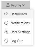
Blazor Dropdown Menu component
The Blazor Dropdown Menu component is a graphical UI component that lets users choose from a list of actions.
Key features:
- Icon Support: Built-in icons and custom icon positioning
- Multiple Sizes: Predefined button sizes
- Separators: Visual separators between menu items
- Disabled Items: Disable specific menu items
- Template Support: Rich templates for menu items
- RTL Support: Right-to-left text direction support
- Keyboard Navigation: Full keyboard support for accessibility
- Custom Styling: CSS and theme customization options
Documentation:
- Getting Started with Blazor Web App
- Getting Started with Blazor WebAssembly App
- Feature Overview
- Live Demos
- API Reference
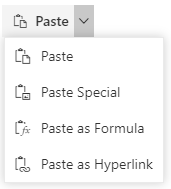
Blazor Split Button component
The Blazor Split Button component triggers a default action when clicked and provides a list of actions in a dropdown.
Key features:
- Primary and Dropdown Actions: Separate primary action and dropdown menu
- Icon Support: Built-in icons and custom icon positioning
- Multiple Sizes: Predefined button sizes
- Disabled Items: Disable specific dropdown items
- Item Separators: Visual separators between menu items
- Template Support: Rich templates for dropdown items
- RTL Support: Right-to-left text direction support
- Keyboard Navigation: Full keyboard support for accessibility
Documentation:
- Getting Started with Blazor Web App
- Getting Started with Blazor WebAssembly App
- Feature Overview
- Live Demos
- API Reference
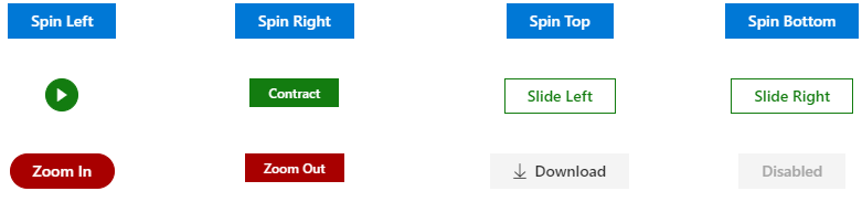
Blazor Progress Button component
The Blazor Progress Button component visualizes the progression of an operation in the background.
Key features:
- Progress Visualization: Display operation progress with visual indicators
- Predefined Styles: Built-in button styles and themes
- Multiple Button Types: Primary, secondary, and custom button types
- Spinner Animation: Animated spinner during progress
- Progress Tracking: Display percentage or duration-based progress
- Custom Content: Include custom templates and content
- Keyboard Navigation: Full keyboard support for accessibility
- UI Customization: Custom CSS and theme options
Documentation:
- Getting Started with Blazor Web App
- Getting Started with Blazor WebAssembly App
- Feature Overview
- Live Demos
- API Reference
Add stylesheet and script references
- For Blazor Server App / Blazor Web App, add these to
Components/App.razororApp.razorfile. - For Blazor WebAssembly App, add these to
wwwroot/index.htmlfile.
<link href="_content/Syncfusion.Blazor.Themes/bootstrap5.css" rel="stylesheet" />
<script src="_content/Syncfusion.Blazor.Core/scripts/syncfusion-blazor.min.js" type="text/javascript"></script>
Quick start
Register the Syncfusion® Blazor services in the Program.cs file.
using Syncfusion.Blazor;

builder.Services.AddSyncfusionBlazor();
Button Group
<SfButtonGroup>
    <ButtonGroupButton>Left</ButtonGroupButton>
    <ButtonGroupButton>Center</ButtonGroupButton>
    <ButtonGroupButton>Right</ButtonGroupButton>
</SfButtonGroup>
DropDownButton
<SfDropDownButton Content="Edit">
    <DropDownMenuItems>
        <DropDownMenuItem Text="Cut"></DropDownMenuItem>
        <DropDownMenuItem Text="Copy"></DropDownMenuItem>
        <DropDownMenuItem Text="Paste"></DropDownMenuItem>
    </DropDownMenuItems>
</SfDropDownButton>
ProgressButton
<SfProgressButton Content="Spin Left"></SfProgressButton>
SplitButton
<SfSplitButton Content="Paste">
    <DropDownMenuItems>
        <DropDownMenuItem Text="Cut" ></DropDownMenuItem>
        <DropDownMenuItem Text="Copy" ></DropDownMenuItem>
        <DropDownMenuItem Text="Paste"></DropDownMenuItem>
    </DropDownMenuItems>
</SfSplitButton>
Support
License
This is a commercial product and requires a paid license for possession or use. Review the Syncfusion® EULA.
About Syncfusion®
Syncfusion® provides 1600+ UI components and frameworks for web, mobile, and desktop development across multiple platforms:
Web: Blazor | ASP.NET Core | ASP.NET MVC | JavaScript | Angular | React | Vue
Desktop: WinForms | WPF | WinUI
Learn more at www.syncfusion.com.
sales@syncfusion.com | Toll Free: 1-888-9-DOTNET
| Product | Versions Compatible and additional computed target framework versions. |
|---|---|
| .NET | net8.0 is compatible. net8.0-android was computed. net8.0-browser was computed. net8.0-ios was computed. net8.0-maccatalyst was computed. net8.0-macos was computed. net8.0-tvos was computed. net8.0-windows was computed. net9.0 is compatible. net9.0-android was computed. net9.0-browser was computed. net9.0-ios was computed. net9.0-maccatalyst was computed. net9.0-macos was computed. net9.0-tvos was computed. net9.0-windows was computed. net10.0 is compatible. net10.0-android was computed. net10.0-browser was computed. net10.0-ios was computed. net10.0-maccatalyst was computed. net10.0-macos was computed. net10.0-tvos was computed. net10.0-windows was computed. |
-
net10.0
- Syncfusion.Blazor.Buttons (>= 33.2.13)
- Syncfusion.Blazor.Core (>= 33.2.13)
- Syncfusion.Blazor.Popups (>= 33.2.13)
- Syncfusion.Blazor.Spinner (>= 33.2.13)
-
net8.0
- Syncfusion.Blazor.Buttons (>= 33.2.13)
- Syncfusion.Blazor.Core (>= 33.2.13)
- Syncfusion.Blazor.Popups (>= 33.2.13)
- Syncfusion.Blazor.Spinner (>= 33.2.13)
-
net9.0
- Syncfusion.Blazor.Buttons (>= 33.2.13)
- Syncfusion.Blazor.Core (>= 33.2.13)
- Syncfusion.Blazor.Popups (>= 33.2.13)
- Syncfusion.Blazor.Spinner (>= 33.2.13)
NuGet packages (19)
Showing the top 5 NuGet packages that depend on Syncfusion.Blazor.SplitButtons:
| Package | Downloads |
|---|---|
|
Syncfusion.Blazor.Inputs
Comprehensive Blazor Syncfusion® input components including TextBox, MaskedTextBox, NumericTextBox, Color Picker, File Upload, Slider, Rating, Signature, OTP Input, and Speech To Text. Features data validation, formatting, keyboard navigation, and accessibility support for .NET 8+. |
|
|
Syncfusion.Blazor.RichTextEditor
Syncfusion® Blazor Rich Text Editor component for composing and formatting HTML content in .NET Blazor apps. Supports toolbar, markdown, paste cleanup, formats, and extensible plugins. |
|
|
Syncfusion.Blazor.PdfViewer
This package provides the functionality to utilize the features of Syncfusion Blazor PDF Viewer component and more. |
|
|
Syncfusion.Blazor.SfPdfViewer
Provides support in the Syncfusion® Blazor PDF Viewer component to load PDF documents, add and edit annotations, and add and edit form fields within the PDF. |
|
|
Syncfusion.Blazor.FileManager
This package contains the Syncfusion® Blazor FileManager component. |
GitHub repositories
This package is not used by any popular GitHub repositories.
| Version | Downloads | Last Updated |
|---|---|---|
| 33.2.13 | 3,352 | 6/16/2026 |
| 33.2.12 | 8,657 | 6/9/2026 |
| 33.2.10 | 6,133 | 6/2/2026 |
| 33.2.8 | 5,921 | 5/26/2026 |
| 33.2.7 | 7,678 | 5/19/2026 |
| 33.2.6 | 10,118 | 5/12/2026 |
| 33.2.5 | 13,663 | 5/4/2026 |
| 33.2.4 | 10,935 | 4/27/2026 |
| 33.2.3 | 17,896 | 4/21/2026 |
| 33.1.49 | 14,236 | 4/13/2026 |
| 33.1.47 | 13,475 | 4/6/2026 |
| 33.1.46 | 6,071 | 3/30/2026 |
| 33.1.45 | 9,952 | 3/23/2026 |
| 33.1.44 | 21,705 | 3/16/2026 |
| 32.2.9 | 18,769 | 3/9/2026 |
| 32.2.8 | 13,127 | 3/2/2026 |
| 32.2.7 | 19,079 | 2/23/2026 |
| 32.2.5 | 13,206 | 2/16/2026 |
| 32.2.4 | 21,710 | 2/10/2026 |
| 32.2.3 | 21,344 | 2/5/2026 |