Syncfusion.Blazor.Notifications
35.1.40
Prefix Reserved
dotnet add package Syncfusion.Blazor.Notifications --version 35.1.40
NuGet\Install-Package Syncfusion.Blazor.Notifications -Version 35.1.40
<PackageReference Include="Syncfusion.Blazor.Notifications" Version="35.1.40" />
<PackageVersion Include="Syncfusion.Blazor.Notifications" Version="35.1.40" />
<PackageReference Include="Syncfusion.Blazor.Notifications" />
paket add Syncfusion.Blazor.Notifications --version 35.1.40
#r "nuget: Syncfusion.Blazor.Notifications, 35.1.40"
#:package Syncfusion.Blazor.Notifications@35.1.40
#addin nuget:?package=Syncfusion.Blazor.Notifications&version=35.1.40
#tool nuget:?package=Syncfusion.Blazor.Notifications&version=35.1.40
Syncfusion Blazor Notification components
A comprehensive suite of Blazor notification and placeholder components for displaying messages, toasts, and loading states. Includes Toast, Message, and Skeleton components.
Using this package with an AI coding agent
Before generating Syncfusion code, ask your AI coding agent to run the Syncfusion setup using the following prompt:
Set up this project for Syncfusion before generating code. Fetch and follow the official instructions at https://ai.syncfusion.com, then report the detected platform, installed skill pack, MCP status, and any required licensing action.The setup detects your project's platform and loads the appropriate Syncfusion skill pack. No Syncfusion account or MCP key is required to install or read Syncfusion agent skills.
Platform reference: https://ai.syncfusion.com/blazor/llms.txt
Supported components
This package includes the following components:
Blazor Toast component
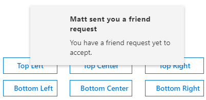
The Blazor Toast component is a small, nonblocking notification pop-up that displays messages to users with readable content.
Key features
- Auto dismissal: Messages disappear automatically after a configurable timeout period
- Positioning: Display toasts at customizable positions (top, bottom, corners)
- Animation effects: Built-in animation effects for toast appearance and disappearance
- Multiple toasts: Display multiple toast notifications simultaneously
- Custom icons: Support for custom icons and visual indicators
- Templates: Rich templates for custom toast content rendering
- Keyboard navigation: Full keyboard support for accessibility
- Action buttons: Include action buttons within toast notifications
Documentation
- Getting Started with Blazor Web App
- Getting Started with Blazor WebAssembly App
- Blazor Toast component features overview
- Blazor Toast component demos
- API reference
- Blazor Toast component video tutorials
Blazor Message component
The Blazor Message component is a graphical user interface for displaying messages with visual severity levels. It differentiates messages with icons and colors to denote the importance and context of the message.
Key features
- Severity levels: Display messages with different severity types (success, error, warning, info)
- Visual icons: Built-in icons for different severity levels
- Closeable messages: Allow users to dismiss messages
- Message variants: Support for different visual variants and styles
- Custom templates: Rich templates for custom message content
- Data binding: Bind to collections for dynamic message display
- Responsive design: Adapt to different screen sizes
- Accessibility: Full keyboard navigation and ARIA support
Documentation
- Getting Started with Blazor Web App
- Getting Started with Blazor WebAssembly App
- Blazor Message component features overview
- Blazor Message component demos
- API reference
- Blazor Message component video tutorials
Blazor Skeleton component
The Blazor Skeleton component is a placeholder that animates a shimmer effect to indicate content is loading.
Key features
- Shimmer effect: Animated loading state with shimmer animation
- Multiple shapes: Support for various skeleton shapes (circle, rectangle, text)
- Custom count: Render multiple skeleton placeholders
- Responsive layout: Adapt to different screen sizes
- Performance: Lightweight placeholder for faster page loads
- Custom styling: Customize appearance with CSS and themes
- Template support: Create custom skeleton layouts
- Accessibility: Semantic HTML with proper ARIA labels

Documentation:
- Getting Started with Blazor Web App
- Getting Started with Blazor WebAssembly App
- Blazor Skeleton component features overview
- Blazor Skeleton component demos
- API reference
- Blazor Skeleton component video tutorials
System requirements
- .NET 8.0 or later (Blazor Server App, Blazor Web App, Blazor WebAssembly App, Blazor Hybrid App)
- See full requirements: system requirements
Installation
Install the Notifications package and the themes package, which provides the stylesheets referenced below:
dotnet add package Syncfusion.Blazor.Notifications
dotnet add package Syncfusion.Blazor.Themes
Add stylesheet and script references
For Blazor Server App / Blazor Web App, add these to Components/App.razor or App.razor. For Blazor WebAssembly App, add these to wwwroot/index.html:
<link href="_content/Syncfusion.Blazor.Themes/fluent2.css" rel="stylesheet" />
<script src="_content/Syncfusion.Blazor.Core/scripts/syncfusion-blazor.min.js" type="text/javascript"></script>
Quick start
Register the Syncfusion Blazor service in Program.cs:
using Syncfusion.Blazor;

builder.Services.AddSyncfusionBlazor();
Message
<SfMessage>Please read the comments carefully</SfMessage>
<style>
    .e-message {
        width: 300px;
    }
</style>
Skeleton
<SfSkeleton Height="15px" Width="200px"></SfSkeleton><br/>
<SfSkeleton Height="15px" Width="100px"></SfSkeleton>
Toast
<div class="col-lg-12 control-section toast-default-section">
    <SfToast ID="toast_default" @ref="ToastObj" Title="Adaptive Tiles Meeting" Content="@ToastContent" Timeout="5000" Icon="e-meeting">
        <ToastPosition X="@ToastPosition"></ToastPosition>
    </SfToast>
    <div class="col-lg-12 col-sm-12 col-md-12 center">
        <div id="toastBtnDefault" style="margin: auto; text-align: center">
            <button class="e-btn" @onclick="@ShowOnClick">Show Toasts</button>
            <button class="e-btn" @onclick="@HideOnClick">Hide All</button>
        </div>
    </div>
</div>

<style>
    #toast_default .e-meeting::before {
        content: "\e705";
        font-size: 17px;
    }

    .bootstrap4 #toast_default .e-meeting::before {
        content: "\e763";
        font-size: 20px;
    }
</style>

@code {
    private SfToast ToastObj;
    private string ToastPosition = "Right";
    private string ToastContent = "Conference Room 01 / Building 135 10:00 AM-10:30 AM";

    private async Task ShowOnClick()
    {
        await ToastObj.ShowAsync();
    }

    private async Task HideOnClick()
    {
        await ToastObj.HideAsync("All");
    }
}
Support and feedback
- For queries, reach our Syncfusion support team or post them through the community forums.
- Request new features through the Syncfusion feedback portal.
Other popular Blazor components
Explore other popular Syncfusion Blazor components curated from UI components, standalone SDKs, and document solution suites.
| UI components | Standalone UI SDK's | Document processing |
|---|---|---|
| Blazor DataGrid | Blazor Gantt Chart | Blazor DOCX Editor |
| Blazor TreeGrid | Blazor Diagram | Blazor Document |
| Blazor Map | Blazor Scheduler | Blazor PDF Viewer |
| Blazor File Manager | Blazor RichTextEditor | Blazor Spreadsheet Editor |
License
This is a commercial product and requires a paid license for possession or use. Syncfusion licensed software, including this component, is subject to the terms and conditions of the Syncfusion EULA. You can purchase a license here or start a free 30-day trial here.
About Syncfusion
Founded in 2001 and headquartered in Research Triangle Park, N.C., Syncfusion has more than 29,000 customers and more than 1 million users, including large financial institutions, Fortune 500 companies, and global IT consultancies.
Today, we provide 1800+ components and frameworks for web, mobile, and desktop development across multiple platforms:
Web: Blazor | ASP.NET Core | ASP.NET MVC | JavaScript | Angular | React | Vue
Desktop: WinForms | WPF | WinUI
Learn more at www.syncfusion.com.
sales@syncfusion.com | Toll Free: 1-888-9-DOTNET
| Product | Versions Compatible and additional computed target framework versions. |
|---|---|
| .NET | net8.0 is compatible. net8.0-android was computed. net8.0-browser was computed. net8.0-ios was computed. net8.0-maccatalyst was computed. net8.0-macos was computed. net8.0-tvos was computed. net8.0-windows was computed. net9.0 is compatible. net9.0-android was computed. net9.0-browser was computed. net9.0-ios was computed. net9.0-maccatalyst was computed. net9.0-macos was computed. net9.0-tvos was computed. net9.0-windows was computed. net10.0 is compatible. net10.0-android was computed. net10.0-browser was computed. net10.0-ios was computed. net10.0-maccatalyst was computed. net10.0-macos was computed. net10.0-tvos was computed. net10.0-windows was computed. |
-
net10.0
- Syncfusion.Blazor.Buttons (>= 35.1.40)
- Syncfusion.Blazor.Core (>= 35.1.40)
-
net8.0
- Syncfusion.Blazor.Buttons (>= 35.1.40)
- Syncfusion.Blazor.Core (>= 35.1.40)
-
net9.0
- Syncfusion.Blazor.Buttons (>= 35.1.40)
- Syncfusion.Blazor.Core (>= 35.1.40)
NuGet packages (13)
Showing the top 5 NuGet packages that depend on Syncfusion.Blazor.Notifications:
| Package | Downloads |
|---|---|
|
Syncfusion.Blazor.DropDowns
Provides Syncfusion® Blazor dropdown and selection components including AutoComplete, ComboBox, DropDownList, ListBox, and MultiSelect controls. Supports data binding, filtering, grouping, cascading, templates, and accessibility features for building robust selection interfaces. |
|
|
Syncfusion.Blazor.SfPdfViewer
Provides support in the Syncfusion® Blazor PDF Viewer component to load PDF documents, add and edit annotations, and add and edit form fields within the PDF. |
|
|
Syncfusion.Blazor.PdfViewer
This package provides the functionality to utilize the features of Syncfusion Blazor PDF Viewer component and more. |
|
|
Syncfusion.Blazor.InteractiveChat
Syncfusion® Blazor Interactive Chat component for building conversational AI interfaces. Supports real-time messaging, user interactions, and integration with AI services. Designed for Blazor Server and Blazor WebAssembly applications. |
|
|
NCPC.Blazor
Set of Blazor components to user within your project |
GitHub repositories
This package is not used by any popular GitHub repositories.
| Version | Downloads | Last Updated |
|---|---|---|
| 35.1.40 | 4,041 | 10/13/2026 |
| 35.1.39 | 3,835 | 10/6/2026 |
| 35.1.37 | 8,341 | 9/29/2026 |
| 34.2.9 | 11,403 | 9/21/2026 |
| 34.2.8 | 10,443 | 9/14/2026 |
| 34.2.7 | 9,672 | 9/8/2026 |
| 34.2.6 | 13,349 | 8/31/2026 |
| 34.2.5 | 8,951 | 8/25/2026 |
| 34.2.4 | 18,386 | 8/17/2026 |
| 34.2.3 | 15,054 | 8/11/2026 |
| 34.2.2 | 21,592 | 8/5/2026 |
| 34.1.33 | 18,532 | 7/27/2026 |
| 34.1.32 | 15,801 | 7/21/2026 |
| 34.1.31 | 19,023 | 7/14/2026 |
| 34.1.30 | 6,362 | 7/9/2026 |
| 34.1.29 | 23,293 | 7/6/2026 |
| 33.2.15 | 36,059 | 6/23/2026 |
| 33.2.13 | 13,348 | 6/16/2026 |
| 33.2.12 | 19,469 | 6/9/2026 |
| 33.2.10 | 8,447 | 6/2/2026 |